I have high expectations of my students in everything they do and creating good PowerPoint Presentations is one of them. Never assume that being “digital natives” magically turns young students into excellent creators of digital content.
So how do we get the students to design high-quality PowerPoint Presentations?
I take two 30-minute sessions at the beginning of the year to teach them about good design.
Session 1: COMPARE bad and good PPTs
Why? By seeing both types, the students themselves notice the differences. Ask them about what they see and have a flipchart ready to record their observations.
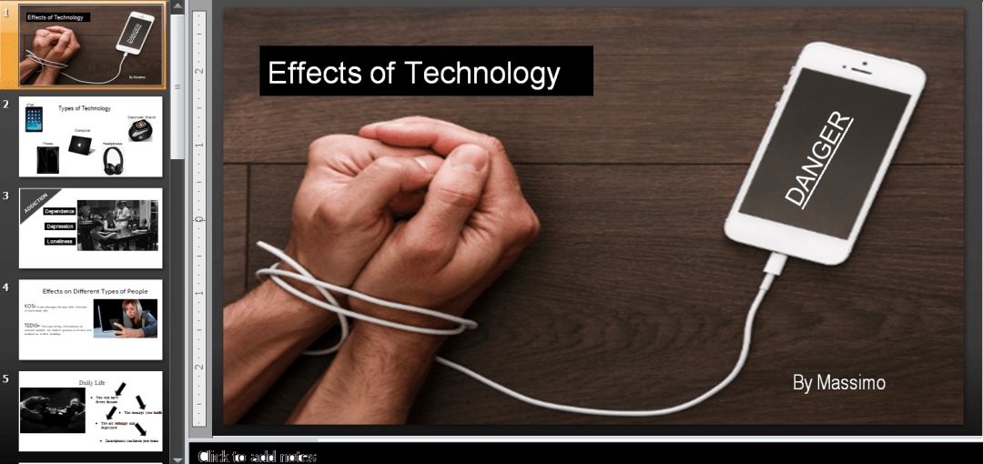
I also show them how one of my 3rd graders changed her slides according to these observations. There is nothing more powerful than seeing how a 9-year-old *can*, in fact, produce work comparable with that of adults’. See below.


Session 2: CO-CREATE a few slides with students
This is where student understanding comes in. Ask students to choose a topic (any topic, really, from pollution to sports and favorite school subjects). Go through every stage of creating the PPT with them: What pictures are more powerful? What color scheme do you think works best? How should we arrange the text? Being in real-time, it is the best way for them to see how creating a high-quality PPT enhances the message, how all design elements combine, and how to use the PPT tools effectively.
When the students (in the next class) create their own PPTs, allow a peer feedback session – have them walk around the classroom and leave feedback to their classmates (e.g. “I think you should use a different color scheme.”, “Some of your text could be deleted.”, “Resize the photo – it is too small.” etc.).
Here are some examples of my students’ work.


10 RULES for good PPTs
- Guy Gawasaki’s 10-20-30 rule (“10 slides – 20 minutes – font not smaller than 30 points”).
- Avoid too much text – only use keywords/ideas/messages
- Use a simple color scheme: not more than 2-3 colors
- Apply the principle of contrast (dark background – light text and vice-versa)
- Use the principle of symmetry
- Recolor photographs to match your color scheme
- Use shapes to emphasize a message
- NO animations
- NO clipart – use powerful, high-quality photographs
- NO premade templates (customize, make it personal)
Finally, if you want inspiration (I, too, share some of these with my students) use Note & Point website – it is by far the best website with a great gallery of wonderful PPTs of all kinds and for all topics.
